If you’ve been on the Internet within the past few weeks, you may have noticed the term “Mobilegeddon” pop up once or twice, possibly even more. But what is “Mobilegeddon” and why are marketers and business owners freaking out over it? In this blog post, we’ll break it down for you – What “Mobilegeddon” is, why you should care as a business owner and how you can prepare your website for what’s to come.
WHAT IS MOBILEGEDDON?
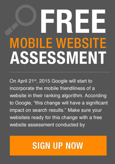
On February 26, Google announced that on April 21, the dominant search engine would be expanding its use of mobile-friendliness as a ranking signal. This means that mobile-friendly websites will begin to rank higher in Google search results once the update goes into effect. Webmasters, consultants and journalists have warned that websites that haven’t been updated to reflect this change will rank lower on Google searches, which can have negative consequences for your overall business.
WHY SHOULD YOU CARE?
It shouldn’t be a surprise when you hear that Google dominates Internet search in the United States. In January, Google led desktop search with a 64.4 percent share, according to online researcher comScore. In March, Google held 84.1 percent of the U.S. mobile and tablet search market, according to StatCounter Global Stats. With over 60% of Google searches being conducted from mobile devices, it only makes sense that their algorithms adapt to these usage patterns.
SHOULD YOU PANIC?
Most publications on the Internet will say that if your website isn’t mobile-friendly, you should be prepared for a rude awakening. We’ll give it to you straight: If you’re not ready, don’t panic. Unlike previous Google updates, where websites that failed to survive Google’s filter were penalized until the search engine decided to re-run it’s filter across the web, the mobile algorithm change will be different. Google will not shun your site if you fail to optimize by April 21. In fact, once your site has been updated to a responsive design, you should see benefits right away
WHAT SHOULD YOU DO NEXT
Along with its announcement, Google released a mobile friendly test page, where business owners can check to see if their site is mobile ready. If your website is not prepared, you should consider investing in an update to a responsive design to make your content adaptable to different viewing formats.
At Brainstorm, we specialize in designing mobile and responsive websites that function seamlessly across a variety of devices. Contact us today and let us put our passion, talents and commitment to work for you.
Here are a couple of recent responsive websites we developed: